
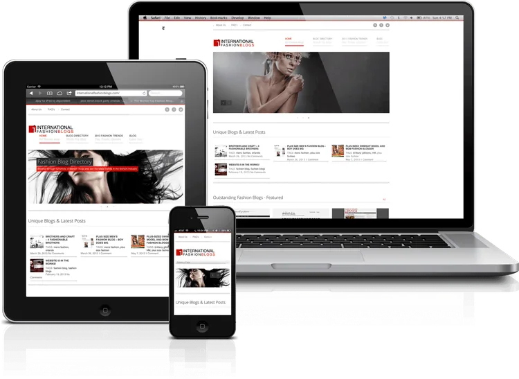
Responsive web design in Dubai
A mobile first world means that every new website must be Responsive Web Design
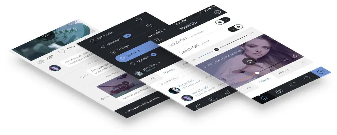
RESPONSIVE WEB DESIGN
Ensure an Optimal User Experience with Responsive Web Design
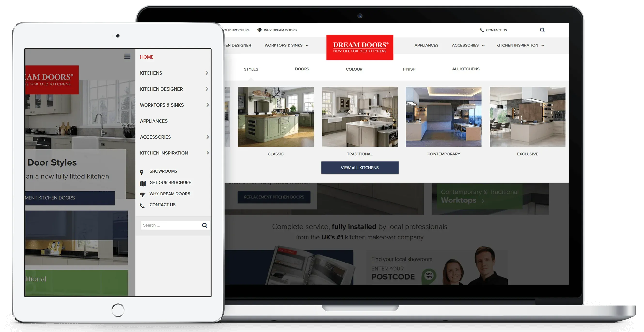
In today's digital landscape, a responsive website is essential for a strong online presence. With users accessing websites on mobile, tablet, and desktop devices, it's crucial to provide a seamless experience across all platforms.
At our iSky, we prioritize user satisfaction. Our expert designers create websites that are scalable and user-friendly on various screen sizes and browsers. We understand the importance of mobile-friendly design, and we incorporate it from the very beginning of the process.
With our extensive experience in responsive web design, we guarantee a high-quality, professional website that reflects your brand and engages your audience. Trust us to deliver a consistent and exceptional user experience across all devices.
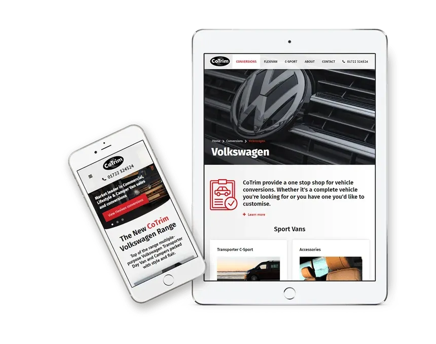
What is Responsive Web Design ?
Unlock the Power of Responsive Web Design for Your Website
Responsive design revolutionizes the way your website adapts to different devices. By using fluid grids and percentages instead of fixed pixels, your site seamlessly adjusts to the screen size of any device.
Although building a responsive website requires additional time, it proves to be cost-effective in the long term. With a responsive design, you only need to maintain and optimize one website, resulting in lower future development and digital marketing expenses.
Investing in responsive design ensures your website remains relevant, accessible, and optimized for search across all devices. Let us bring the benefits of responsive design to your online presence and save you time and money.
Responsive Web Design : It’s all about user experience
Deliver an Exceptional User Experience with Responsive Design
Your users deserve a seamless experience on your website, regardless of the device they use. Our approach focuses on scaling and adjusting content to provide optimal viewing and usability across all devices. We prioritize ease of use and intuitive navigation, ensuring users can easily perform desired actions.
With a forward-thinking mindset, we consider your target audience and their engagement patterns. During the design phase, we present wireframes and detailed mock-ups for desktop, tablet, and mobile devices, giving you a clear vision of the final product's appearance.
By embracing responsive design, we guarantee a consistent and visually appealing user experience that drives engagement and achieves your website goals.
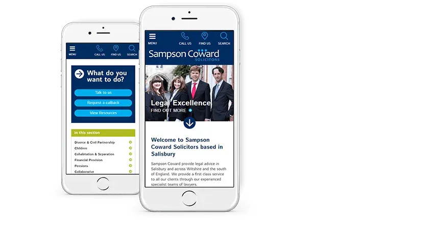
Responsive Web Design
Design that responds and adapts itself for optimal viewing on multiple devices, like desktops, tablets and mobiles.
Tested
We run our projects using an accredited quality management system and our QA team will test the site on multiple screen sizes, devices and browsers.
User Experience
Keep your site looking great and create a consistent user journey across all devices.
Professional
A fully functional and easy to use responsive design will help make your business look modern and professional in the online marketplace.
Optimise the design for search engines
Mobile-First Indexing: Rank Higher with Responsive Design
With more Google searches originating from mobile devices than desktops, Google has introduced a mobile-first indexing and ranking algorithm. This means that Google prioritizes crawling and evaluating the mobile version of your website for ranking purposes.
A responsive design aligns perfectly with Google's mobile-first indexing strategy. By having a responsive website, you gain an advantage over competitors who lack mobile optimization. This increases your chances of ranking higher in search results and capturing valuable organic traffic.
Stay ahead of the competition and improve your online visibility with a responsive website that meets Google's mobile-first indexing requirements.
Content Marketing, Blogging & Social Media
Maximize Content Visibility with a Responsive Website
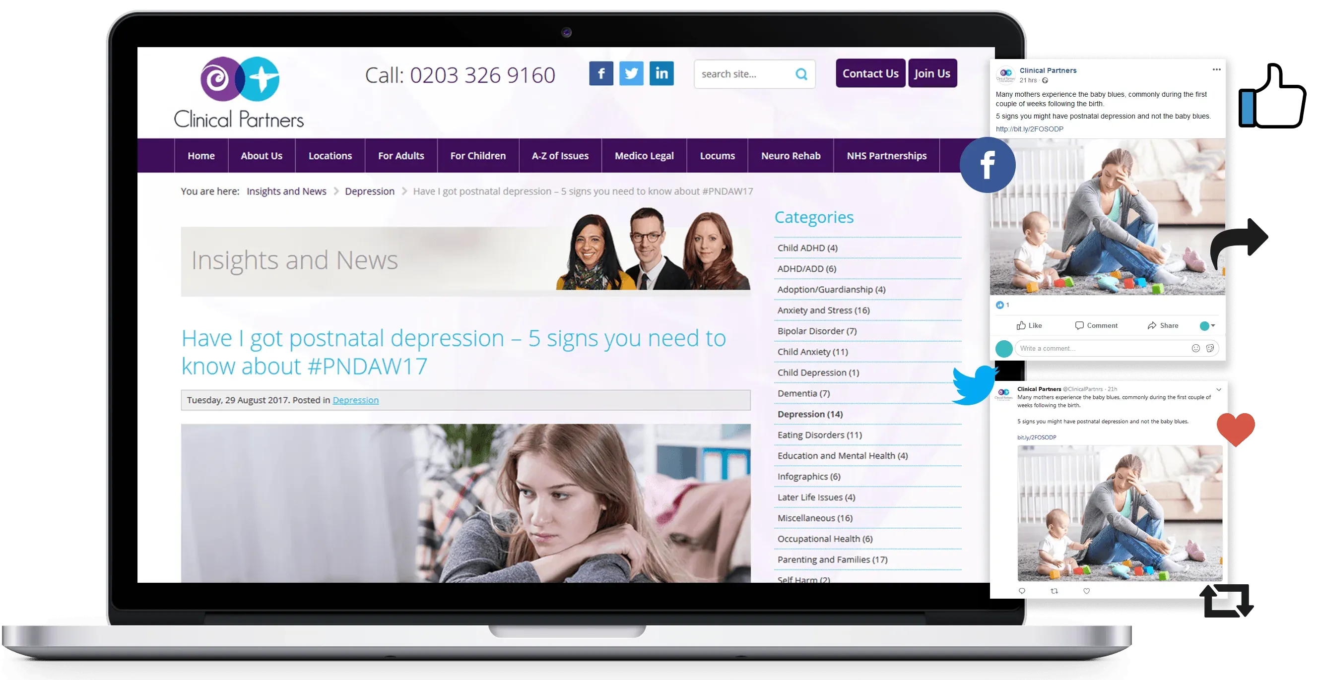
Don't let your valuable content go unnoticed. In today's mobile-driven world, it's crucial to ensure that your content is easily accessible across all devices. By directing users to a responsive website, you enhance the chances of getting more views and shares.
When you actively create and share content on your website and social media platforms, it's highly likely that users will engage with it on their mobile devices. A responsive website provides a seamless and user-friendly experience, making it convenient for users to explore and interact with your content.
Optimize your content reach by leveraging a responsive website that ensures quick loading times and effortless navigation, increasing the likelihood of views, shares, and overall engagement.
Tell us about your project
To find out more about our services and how we can help your business please get in touch.
SEND AN ENQUIRY CONTACT FORM
Joomla web design
User friendly and mobile friendly CMS, the platform millions of websites are built with.
WordPress web design
Easy to use CMS with a huge range of plugins already developed.
CMS web design
Modern websites are designed and built around a content management system.
UX web design
Our knowledge in usability, accessibility and visual design will enhance your users experience.
The Arabic page is the heavier page on a Dubai phone
An Arabic letter changes shape with where it sits in a word, so the typeface carries those shapes and the tables that choose between them in the same file. That makes the Arabic face the heavier of the two files a bilingual page loads, and on mobile data — in a lift in a Business Bay tower, in a basement car park — the difference is visible. We subset the Arabic face to what the site actually uses, preload it, and pick a fallback with close letter widths so the layout does not jump when the real font lands.
Then there is light. Pages here are read outdoors on a site visit, in a car at midday, on a screen dimmed to save battery. Arabic letters are told apart by their dots, and dots are the first thing glare takes, so at the narrow breakpoints we hold contrast and stroke weight up on the Arabic side: no hairline rules, no grey-on-grey captions.
Links travel here by chat thread and social feed, opening inside those apps' own browsers rather than Safari or Chrome. Those give the page less height than the screen, with the app's controls across the bottom, where a mirrored Arabic layout puts its main button. We size heroes and sticky bars to the viewport the page is actually given, and check the Arabic build inside them on a real handset.
More in this family
- Graphic designMake your business unforgettable with impactful branding and design.
- Video productionEngage and grow your business with compelling videos Production
- Web designOur user-centric web design approach ensures exceptional websites that prioritize the needs of your users. We create Web Design that drive online traffic and achieve key objectives for your business.
- UX designUser Experience UX Design focuses on testing and enhancing the usability and accessibility of your website or mobile application to provide a seamless and satisfying experience for your users. Our UX Design experts prioritize simplicity, intuitive navigation, clear branding, contact information, breadcrumbs, page names, and compelling call-to-action elements. By following the principle of "don'…
- Design for printBringing Print design to life with quality litho and digital printing
Have a project? Let's talk.
Tell us what you are trying to build. You will get a written scope and a price before any work starts.