
Blog
The Psychology of Color in Web Design Choosing the Right Palette
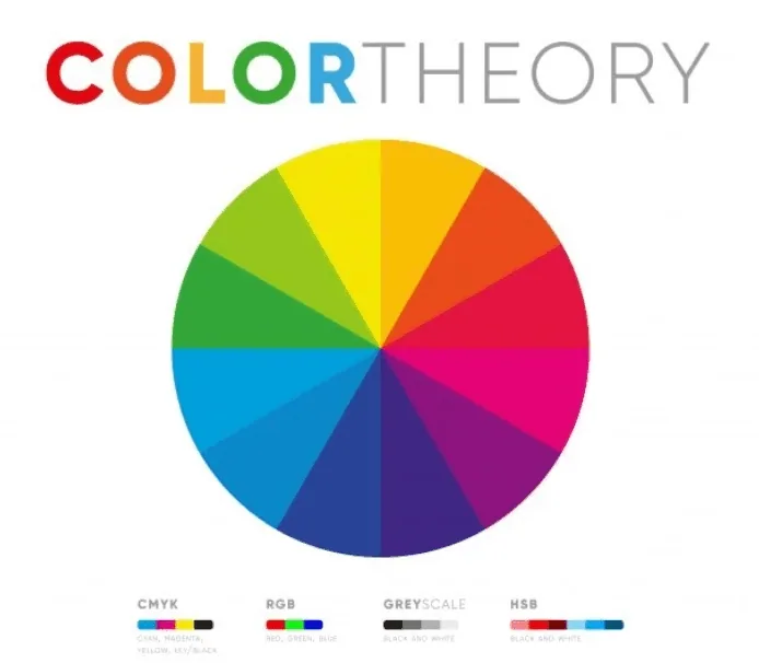
The psychology of color in web design is a fascinating aspect that influences user experience, brand perception, and even conversion rates. Choosing the right color palette can evoke certain emotions, convey specific messages, and guide users through your website. Here's a breakdown of some commonly used colors in web design and their psychological effects:
- Blue: Blue is often associated with trust, security, and professionalism. It's a calming color that is frequently used by businesses to convey reliability and competence. Social media platforms like Facebook and Twitter utilize blue to establish trust and credibility.
- Red: Red is a bold and attention-grabbing color that is often associated with energy, excitement, and urgency. It can evoke strong emotions and stimulate appetite, which is why it's commonly used by food-related websites and in call-to-action buttons to encourage action.
- Green: Green is closely linked to nature, health, and tranquility. It's a versatile color that can represent growth, freshness, and balance. Environmental organizations, health-related websites, and financial institutions often use green to convey stability and growth.
- Yellow: Yellow is a cheerful and optimistic color that can grab attention and evoke feelings of warmth and positivity. It's commonly used to signify happiness, youthfulness, and creativity. However, it's essential to use yellow sparingly, as excessive use can be overwhelming or even cause anxiety in some users.
- Purple: Purple is associated with luxury, creativity, and spirituality. It's often used to evoke a sense of sophistication and elegance. Brands targeting a more artistic or imaginative audience may use purple to convey originality and uniqueness.
- Orange: Orange is a vibrant and energetic color that combines the warmth of red with the cheerfulness of yellow. It's often associated with enthusiasm, creativity, and affordability. Orange can create a sense of excitement and urgency, making it suitable for promoting sales or discounts.
- Black: Black is a powerful and sophisticated color often associated with elegance, formality, and authority. It can create a sense of mystery and depth. Many luxury brands use black as a primary color to convey exclusivity and prestige.
- White: White is associated with simplicity, cleanliness, and purity. It's commonly used as a background color in web design to create a sense of spaciousness and to allow other colors and content to stand out. White can also evoke a sense of neutrality and impartiality.
Recent writing
The Basics of HTML5 and CSS3 for Beginners
In the vast realm of web development, HTML5 and CSS3 are like the twin pillars holding up the structure of the internet. For beginners dipping their toes into the world of web design and development, understanding the basics of HTML5 and CSS3 is akin to learning the alphabet before diving into writi
Tips for Creating Engaging and Interactive Websites
In the digital age, a website is often the first point of contact between a business and its audience. Whether you're an entrepreneur, a blogger, or a large corporation, the success of your online presence hinges on how engaging and interactive your website is. An engaging website not only attracts
Mastering Mobile First Web Design Best Practices
In today's digital age, where mobile devices have become ubiquitous companions in our daily lives, the significance of mobile-first web design cannot be overstated. With a majority of internet users accessing websites through smartphones and tablets, businesses and developers must prioritize creatin
Have a project? Let's talk.
Tell us what you are trying to build. You will get a written scope and a price before any work starts.